
Project 2:
tooltips
tooltips
Outcomes of the Project
Successfully consolidated 6 inconsistent tokens into 2 improved tokens, used in the Duolingo app's lesson and path interfaces.
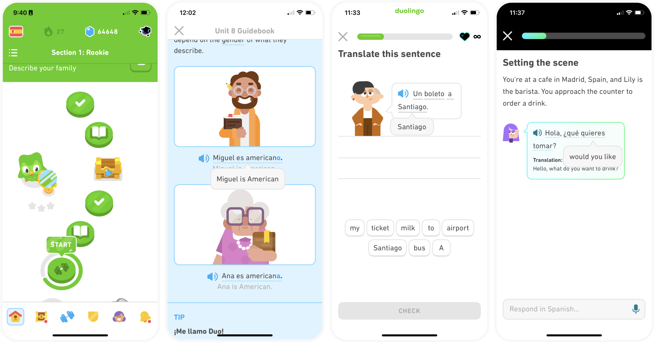
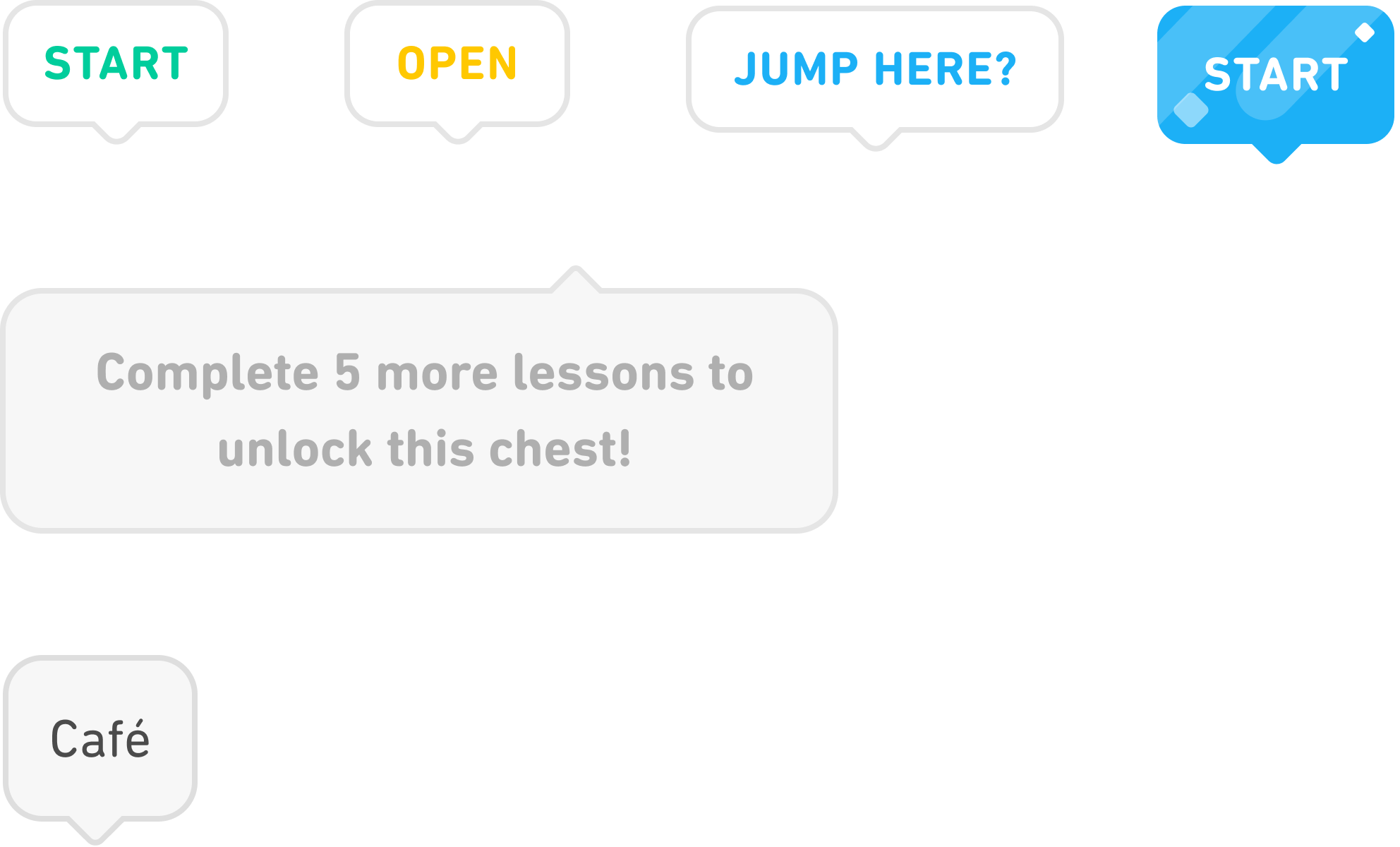
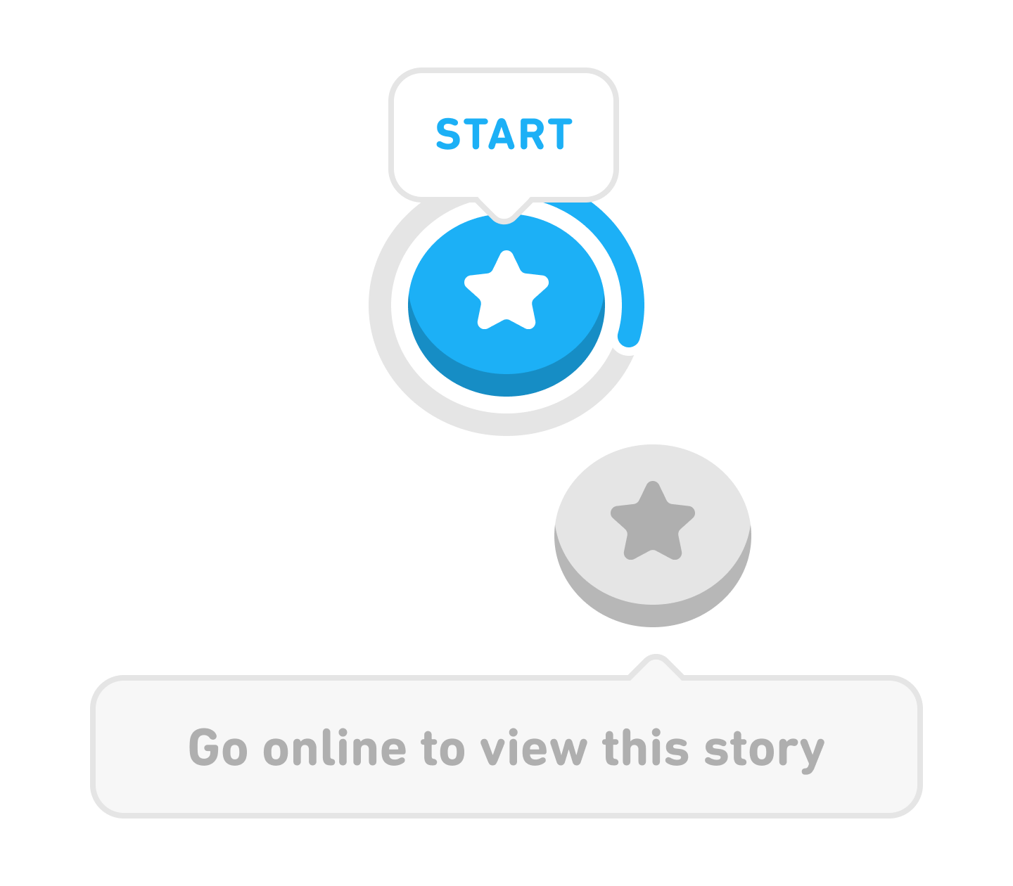
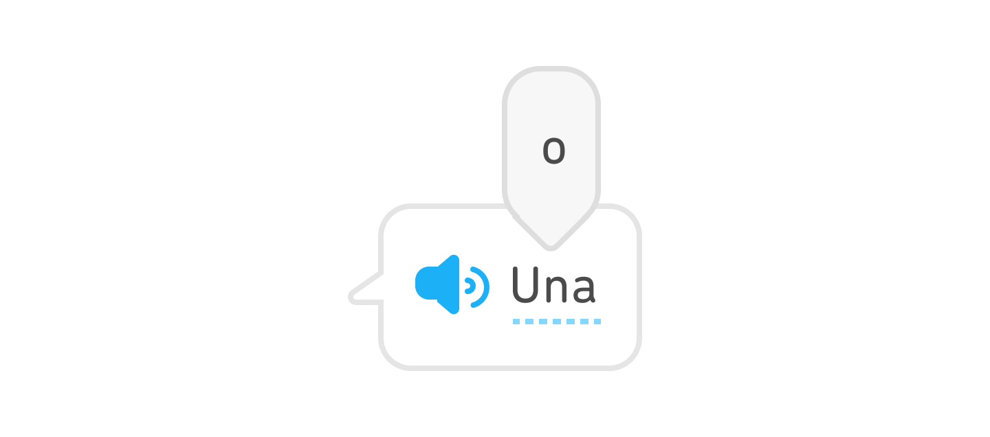
Current app screens

The design process for the tooltip components closely resembled that of the text inputs. Thanks to the project's simpler use cases, structures, and properties, along with my improved proficiency, I was able to expedite the process. I encountered some intriguing challenges, which I will discuss along with my strategies for overcoming them. For a more in-depth look at my system design process, please refer to my text input project.


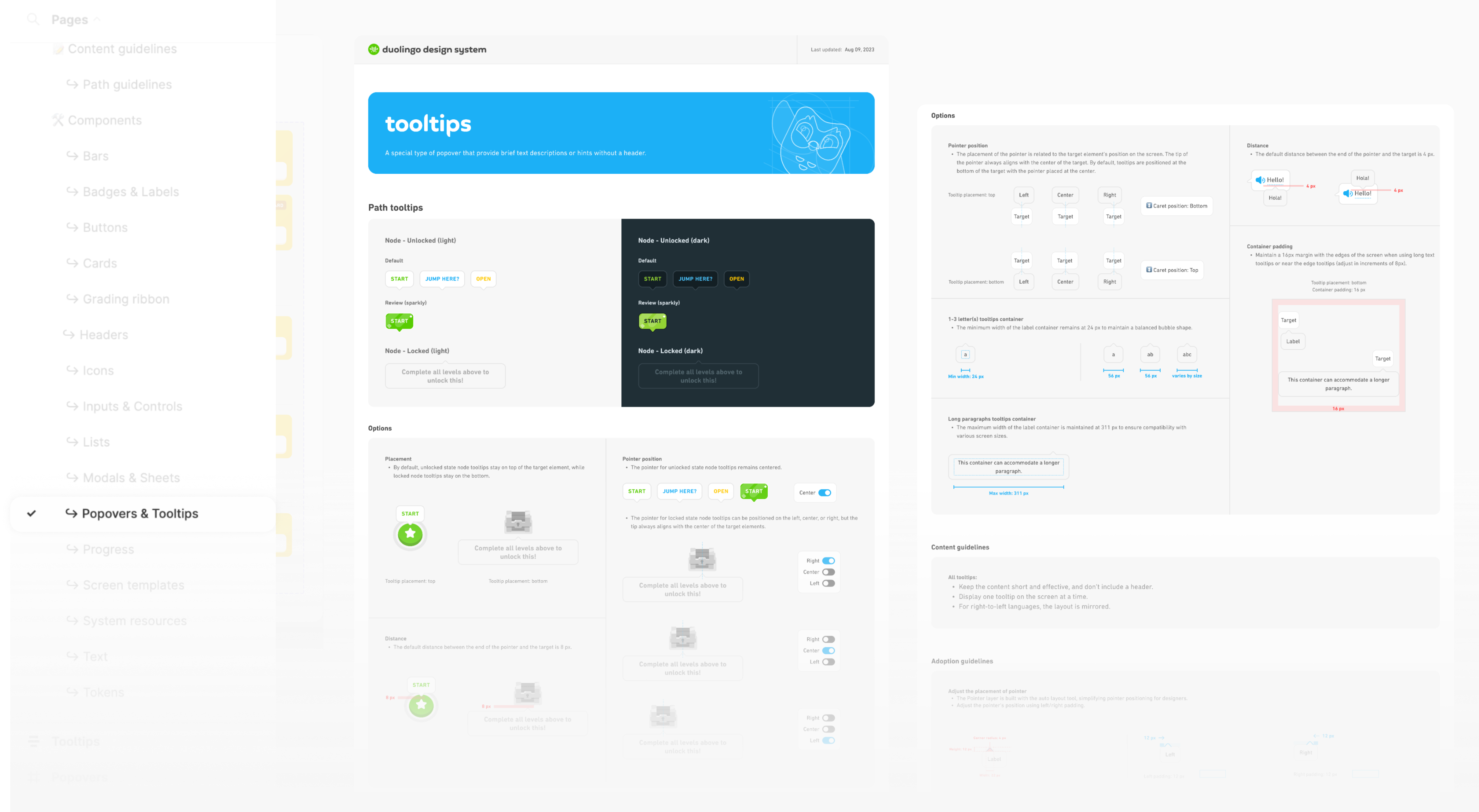
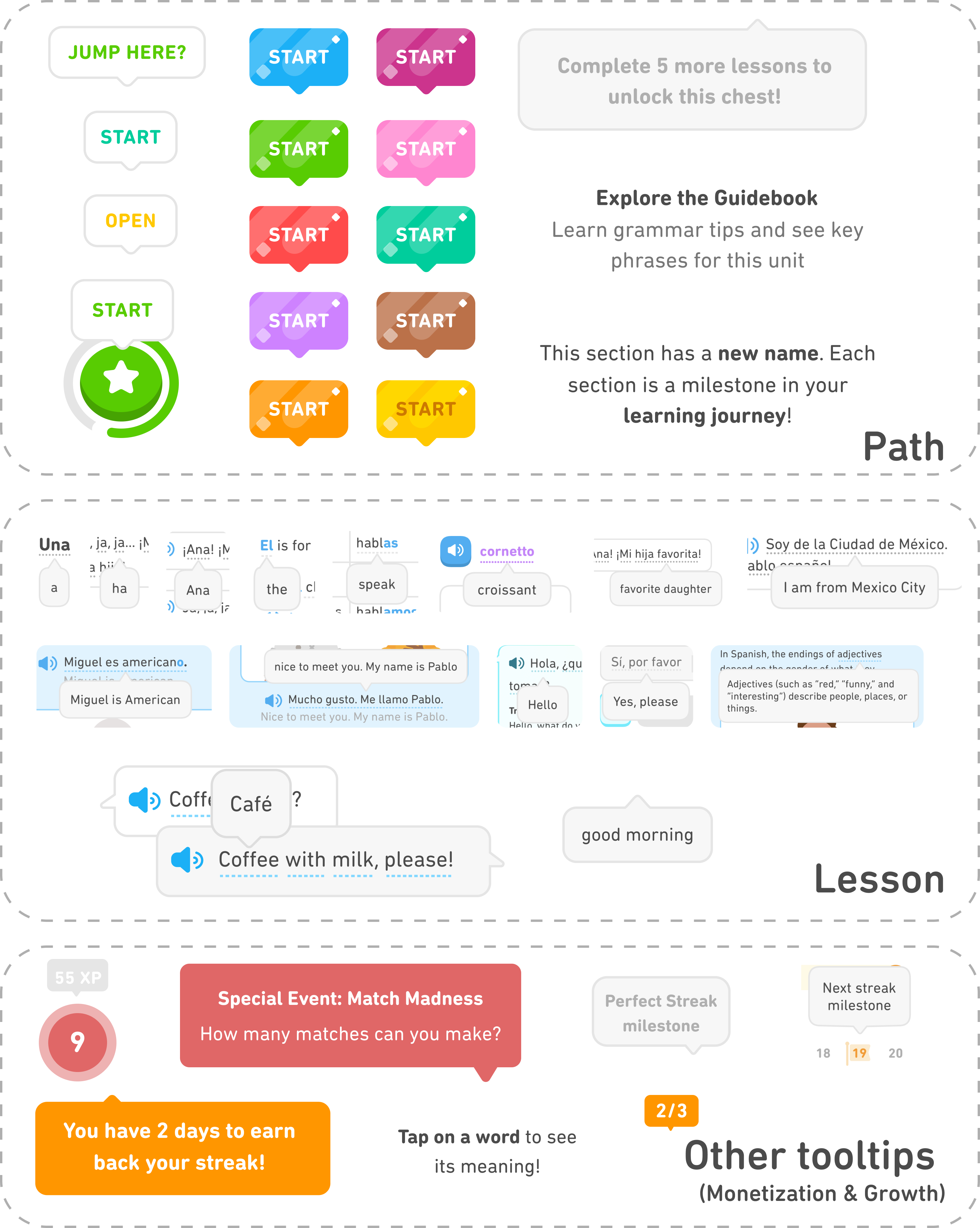
All the tooltips in Duolingo app can be firstly sorted into three parts, including path tooltips, lesson tooltips, and tooltips in other area.
Scope down to path tooltips and lesson tooltips, which have similar structures, can be scaled to other tooltips in the app in the future.
By meeting with designers from all areas, I was able to narrow down the scope of this project. These two types of tooltips are used most frequently, and their design languages have already been defined, whereas the designs of other tooltips are constantly evolving to accommodate new features.

Prioritize issues that need to be addressed to enhance product quality.
Key research finding:
Tooltip designs vary across the app and Figma design files, with updates in each area sometimes isolated.
HMW:
How might we design to maintain design consistency and achieve efficient API design?
Key research finding:
Some of Duolingo's tooltips work differently from the common industrial standard.
HMW:
How might we design to align with Duolingo’s design language and reduce leaner confusion?
Key research finding:
Edge cases involving multiple languages cause unbalanced visual elements.
HMW:
How might we design to maintain visually balanced interface and make it adaptable to various languages?

- Insufficient display of important help information.
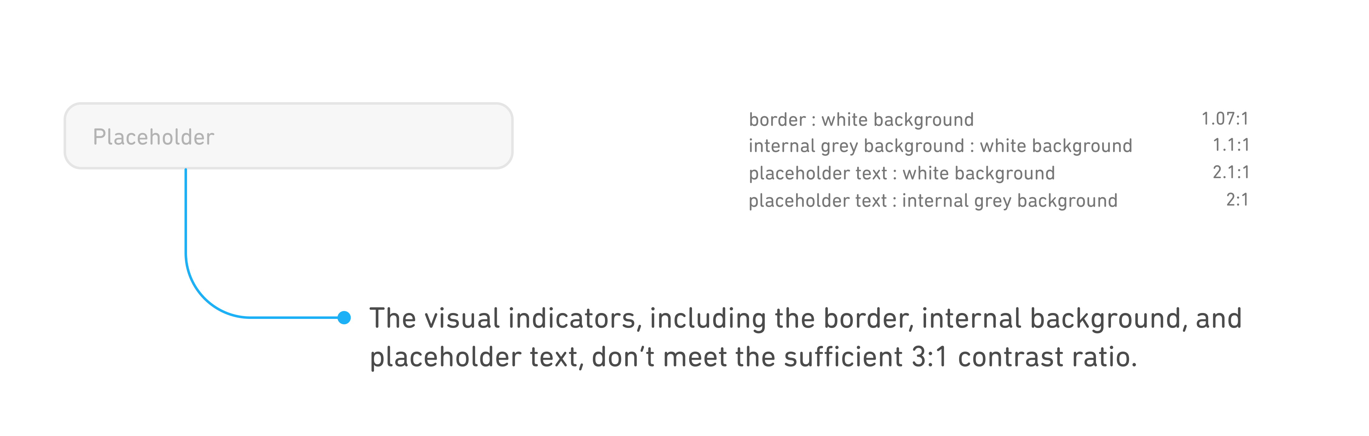
- Low non-text contrast ratio.
- Low non-text contrast ratio.
Current design
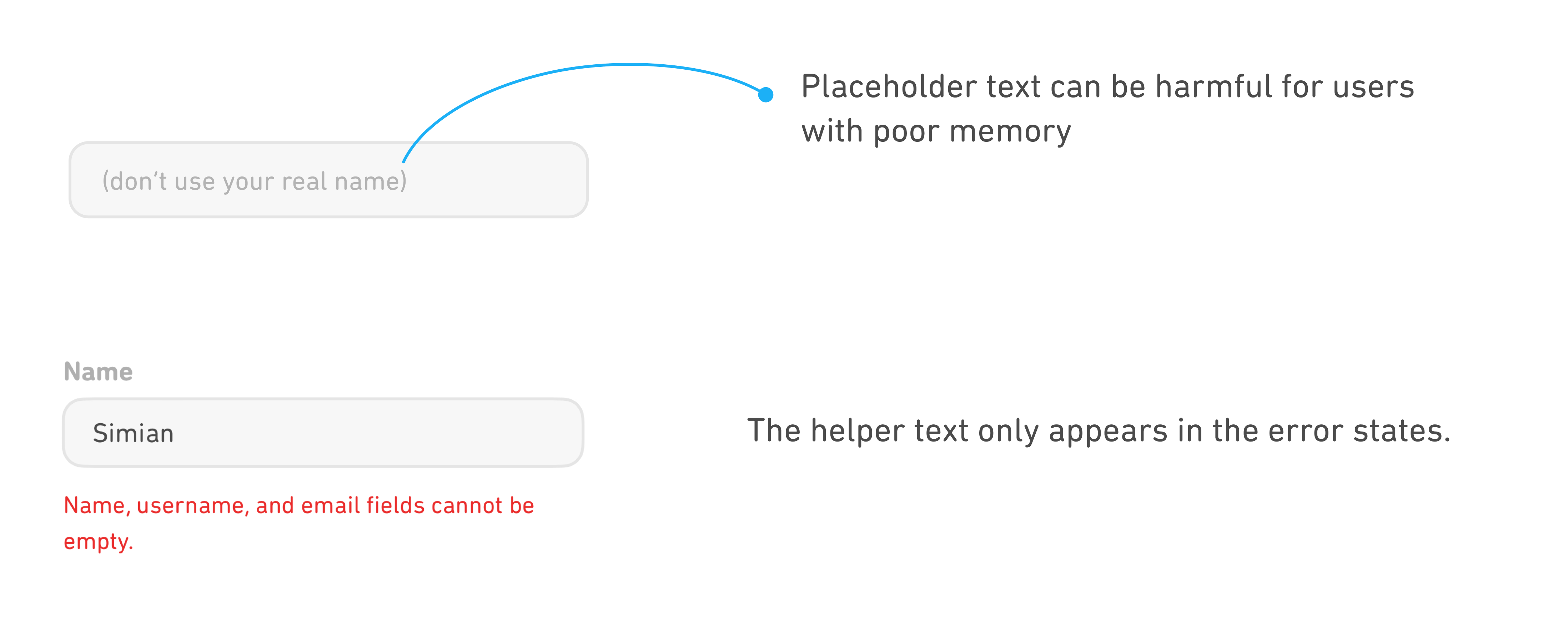
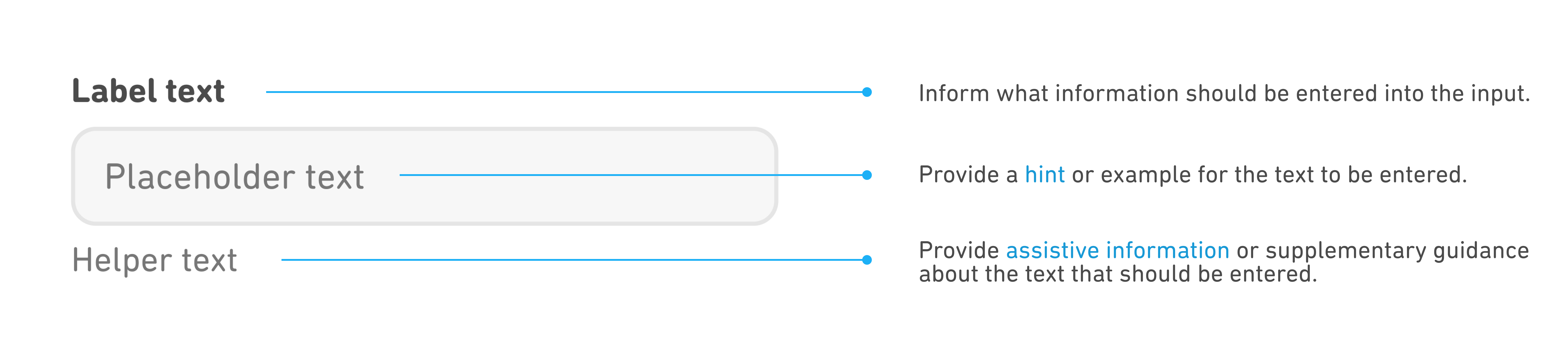
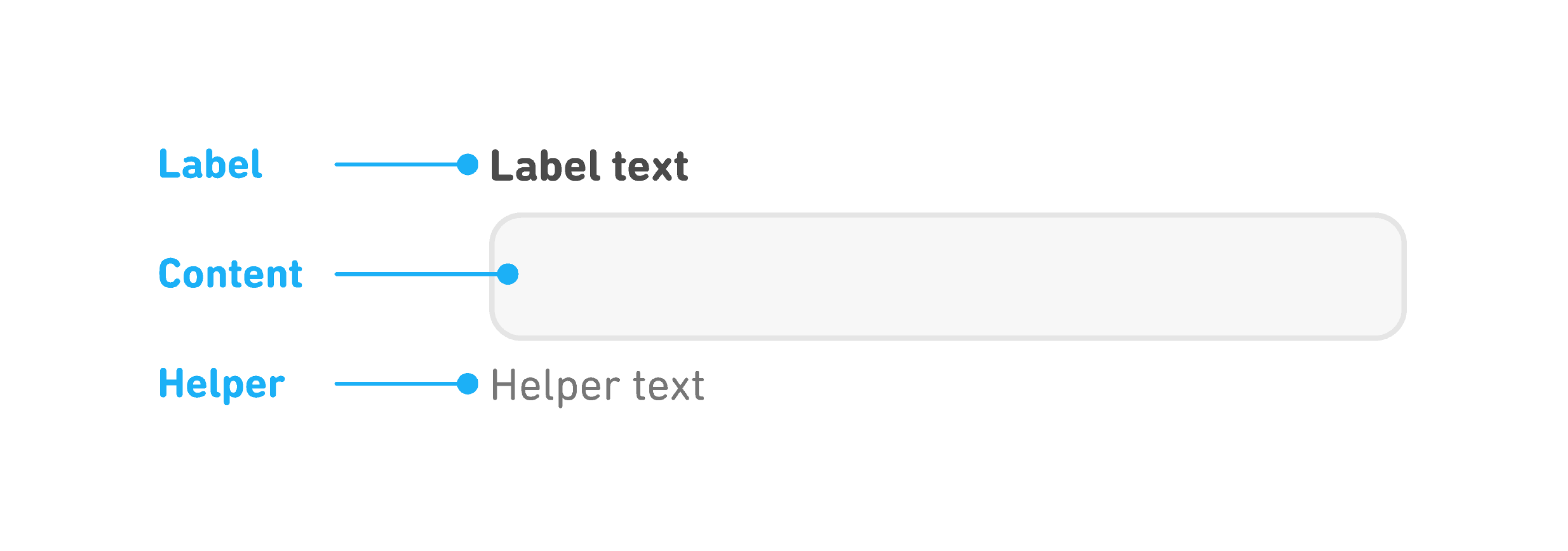
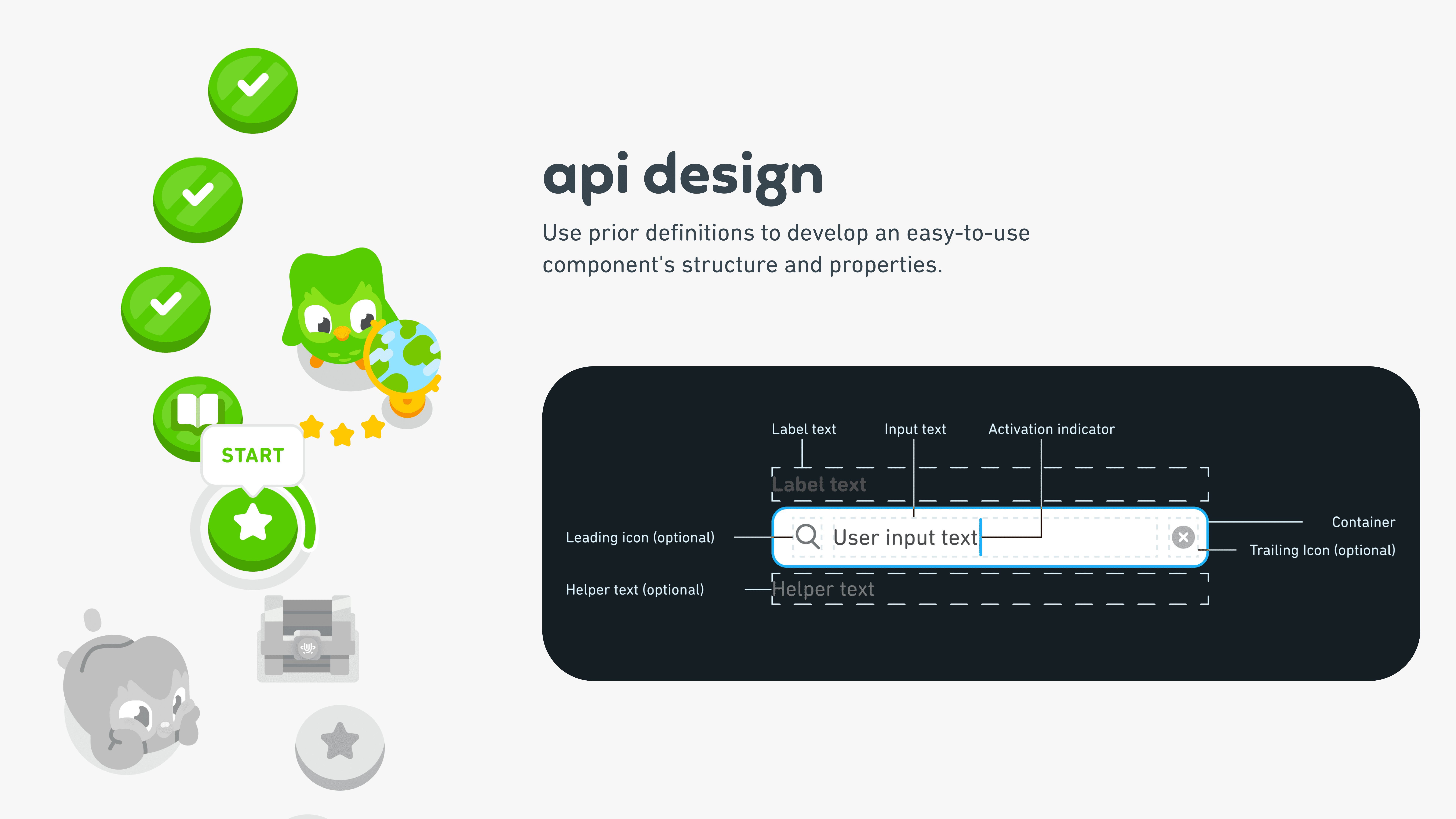
Through my research, this is the common anatomy of a text input.
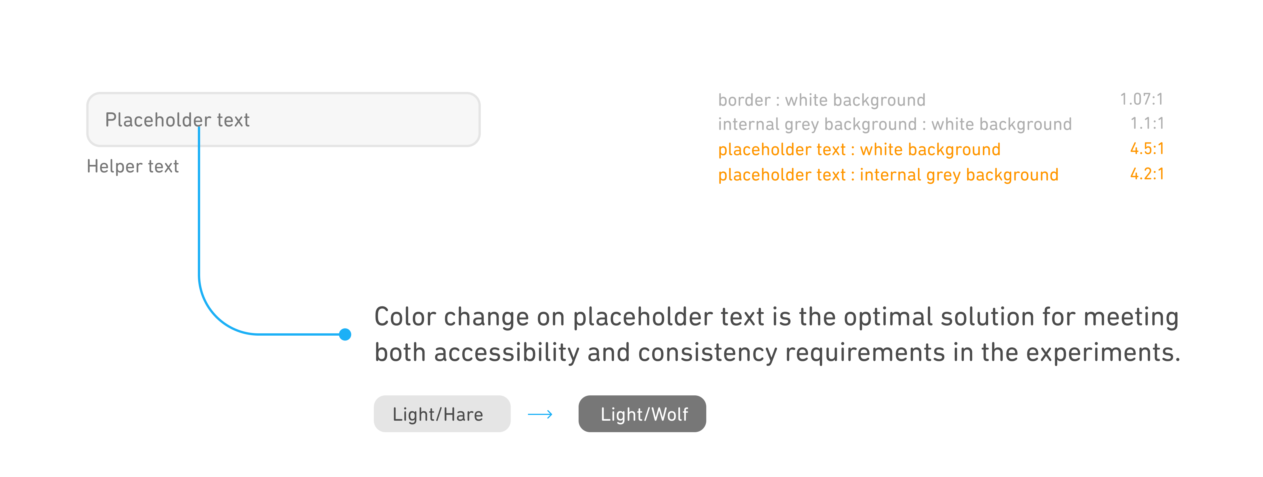
- In design system, the new text inputs don't show the placeholder text. Because we want to encourage our designers to consider using helper text to display important assistive information.
- Improve the contrast ratio for both the placeholder and helper text.
- Improve the contrast ratio for both the placeholder and helper text.
Iterated design

Prioritize quick identification of information hierarchy.
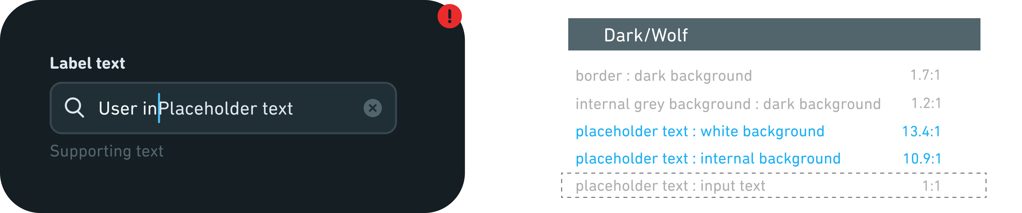
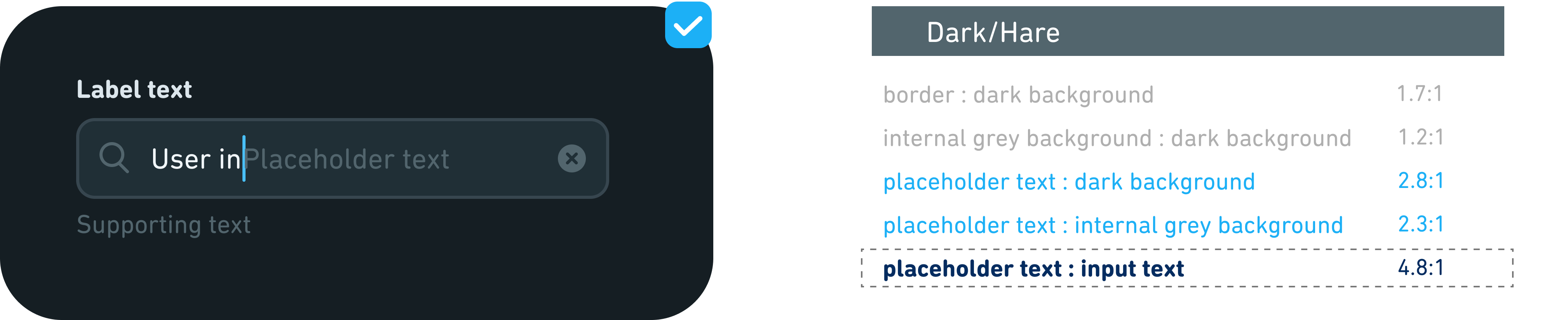
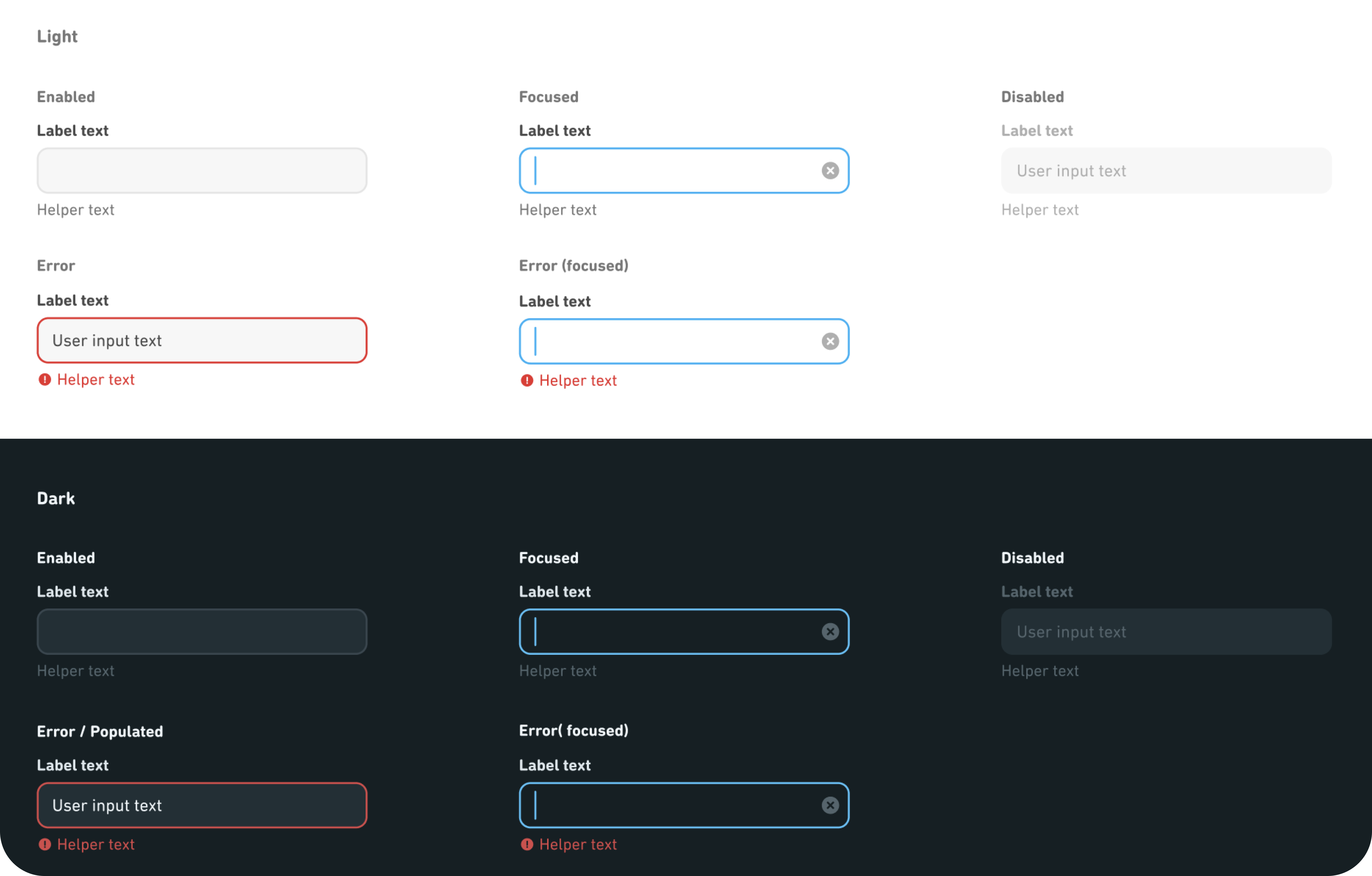
In addition to the light mode, we also want to focus on the accessibility of dark mode.
Dark mode design adheres to light mode principles. Initially, Dark/Wolf was considered for placeholder text, reflecting Light/Wolf in light mode. However, its low contrast with the stronger input text color can hinder users' ability to differentiate between input text and placeholder text. Thus, I suggest using Dark/Hare, a lower tier color, for placeholder text and recommend expanding our color palette for future contrast needs.
Dark mode design adheres to light mode principles. Initially, Dark/Wolf was considered for placeholder text, reflecting Light/Wolf in light mode. However, its low contrast with the stronger input text color can hinder users' ability to differentiate between input text and placeholder text. Thus, I suggest using Dark/Hare, a lower tier color, for placeholder text and recommend expanding our color palette for future contrast needs.
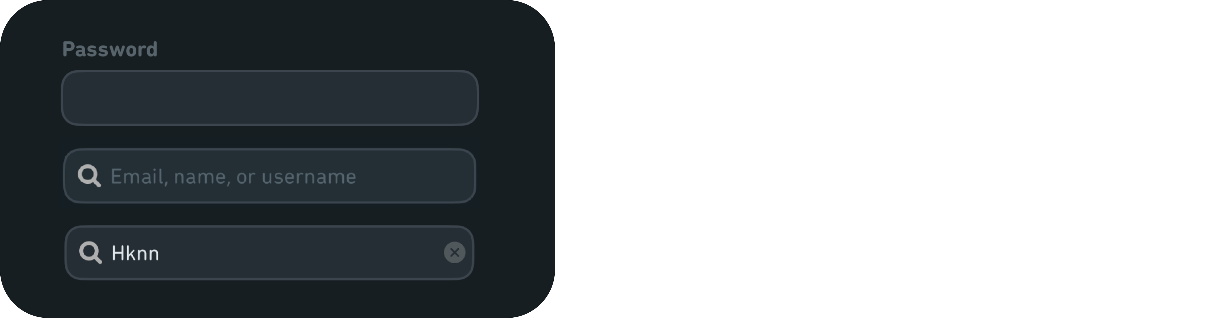
Current design
Experiment
Iterated design

Current states design are not consistent and strong enough.
Current design
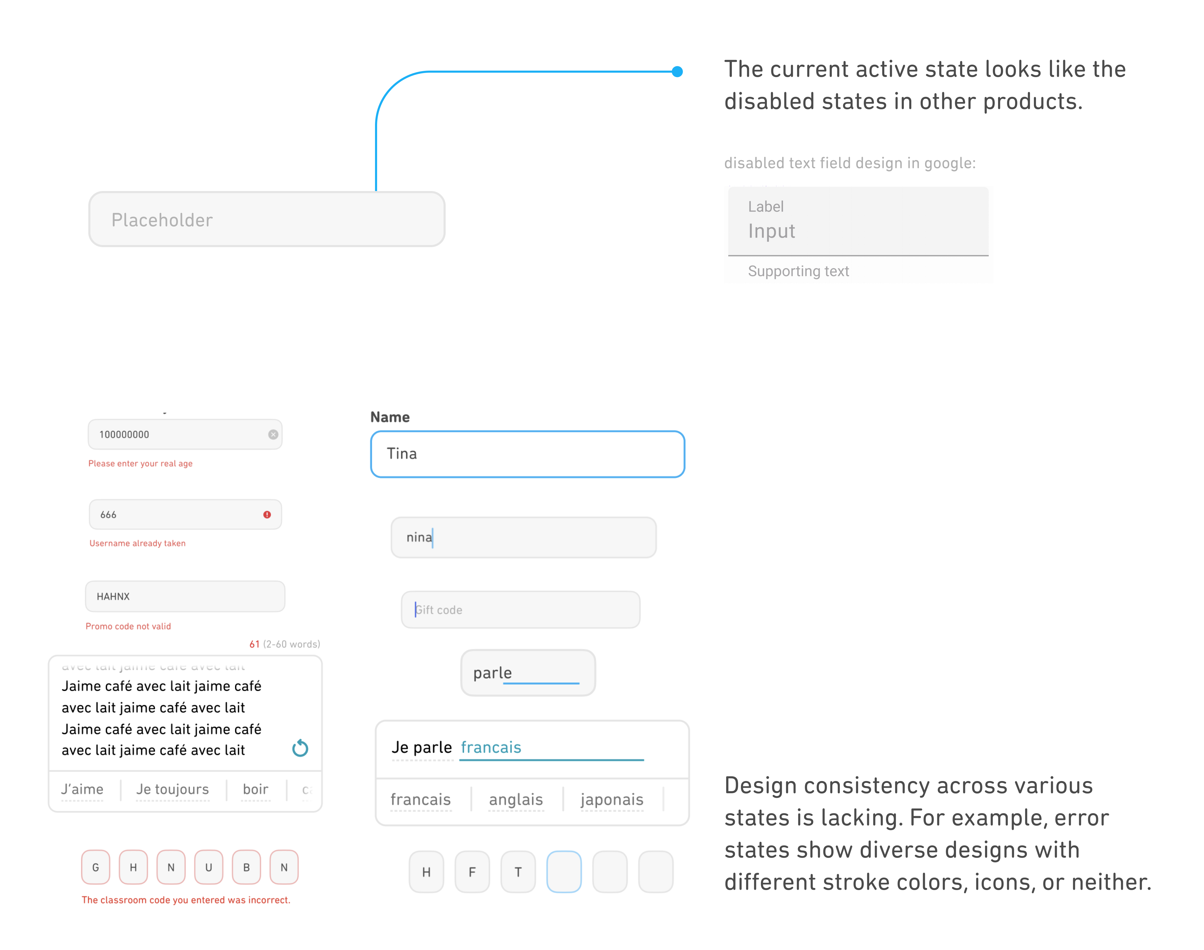
Enhanced consistency and visual indications.
These represent the optimal solutions derived from our experiments, primarily focusing on color unification and providing enough visual indications to communicate different states.
Iterated design

