
Project 1:
text inputs
text inputs
Outcomes of the Project
Successfully consolidated 8 inconsistent tokens into 1 improved token, used in 80% of the Duolingo app interface.
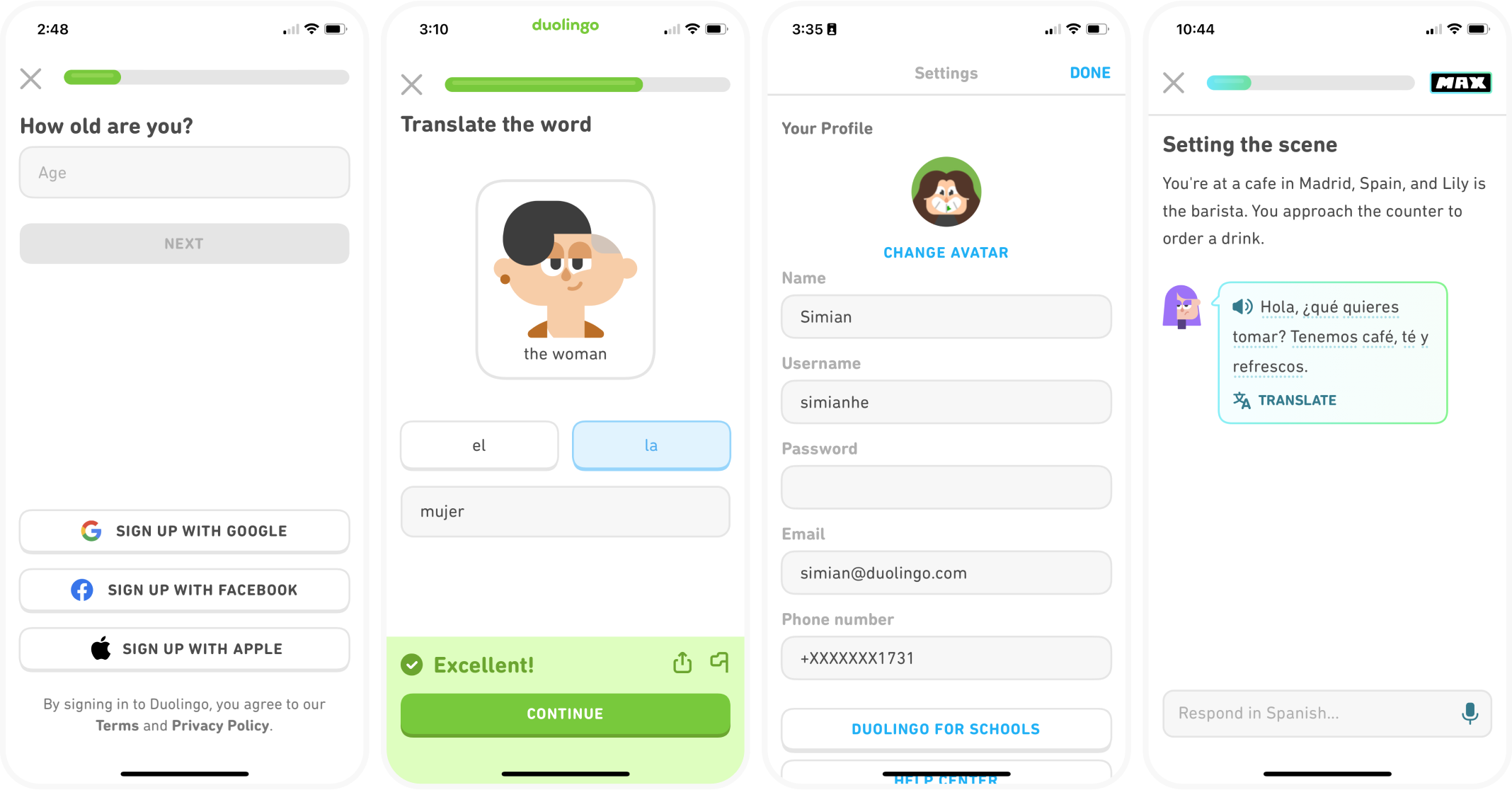
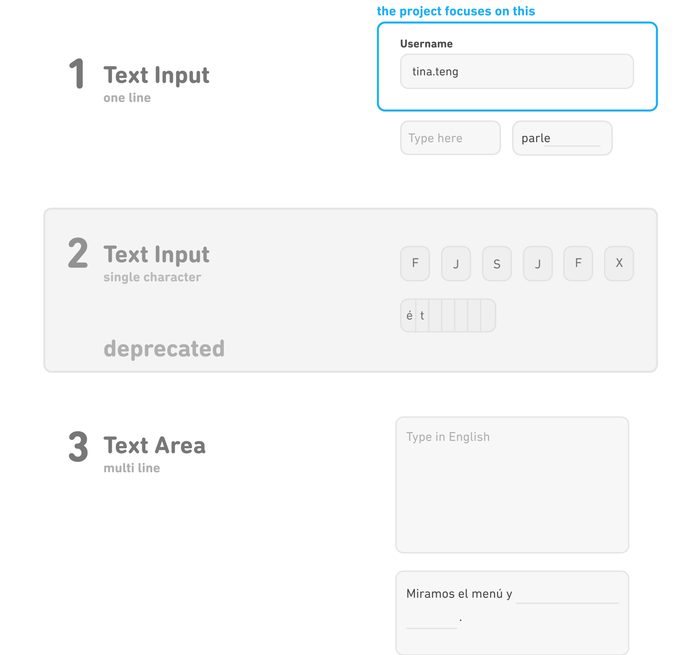
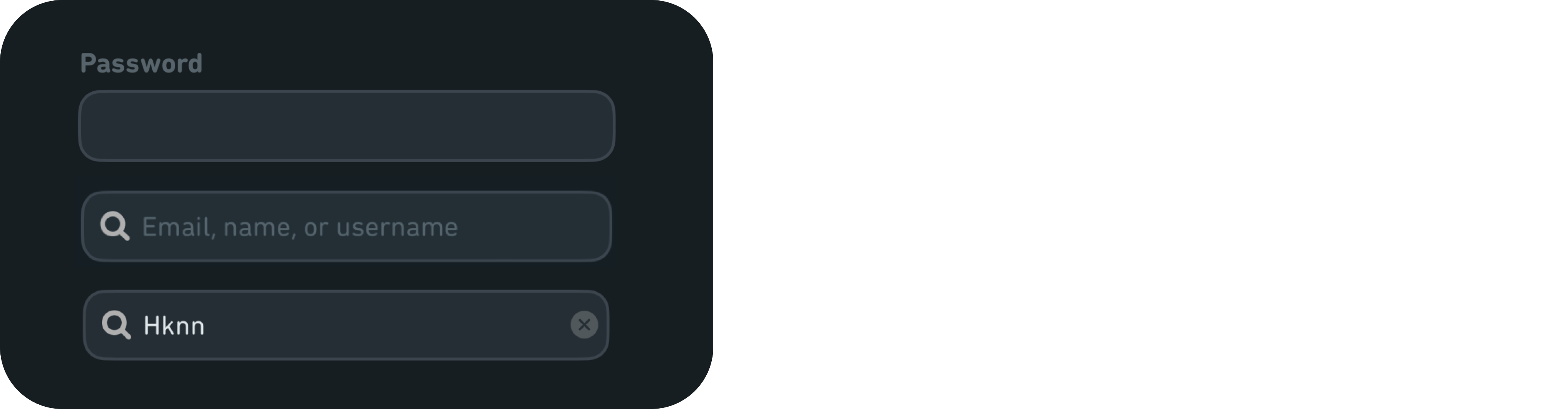
Current app screens

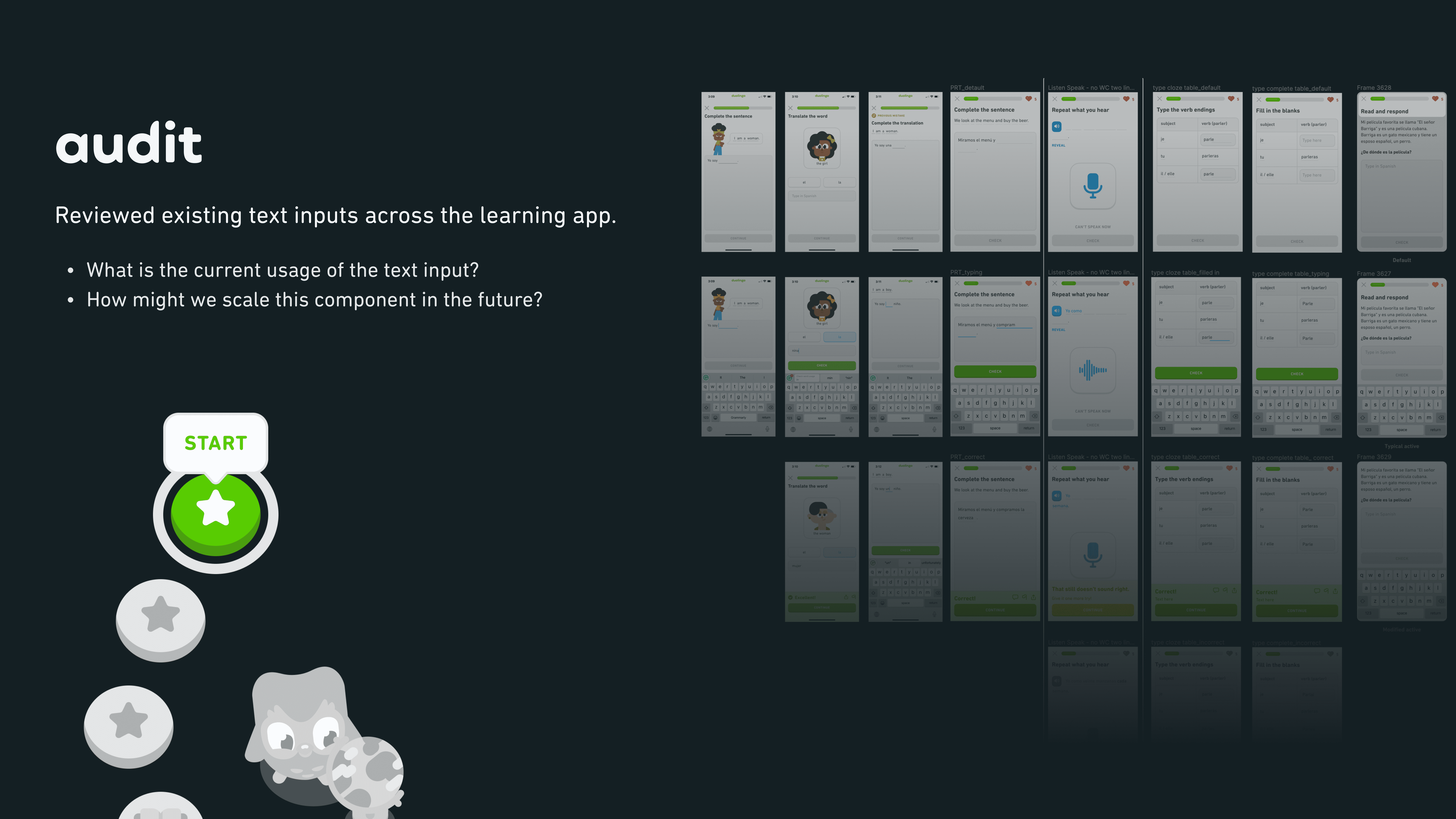
The first step was to identify inconsistencies and understand use cases. Here I wanted to get a bigger picture. I collected screens featuring all types of text entry components. They are primarily from the current app and Figma design files. Understanding all use cases was vital, but given our fast pace, identifying the latest designs and understanding why they had been designed that way was challenging.
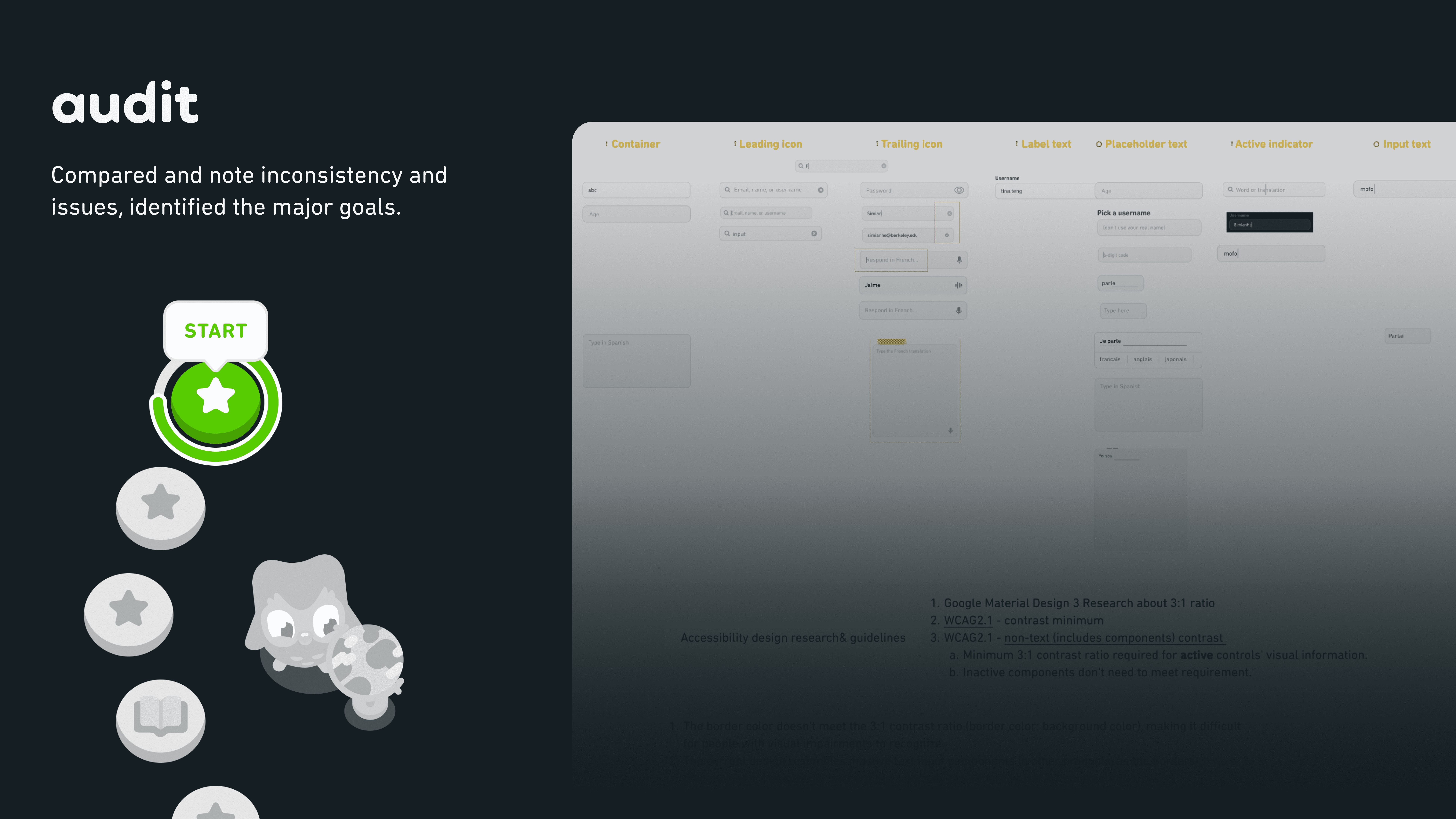
I made a design checklist to compare the component design in our app with in other design systems. The checklist contains all the elements to consider when designing a text entry component. Such as container, icons, text, and accessibility requirements. By doing this way, I could easily note the detailed issues our inputs could be improved.
Cross-functional communication to stay on top of updates is my strategy for performing an company-wide audit and determine the standard to uphold.
Inputs are mainly used in lesson and setting. The objective of the meeting with learning area designers was to understand current usage cases, the problems the designers have discovered, and what the future expectations are.
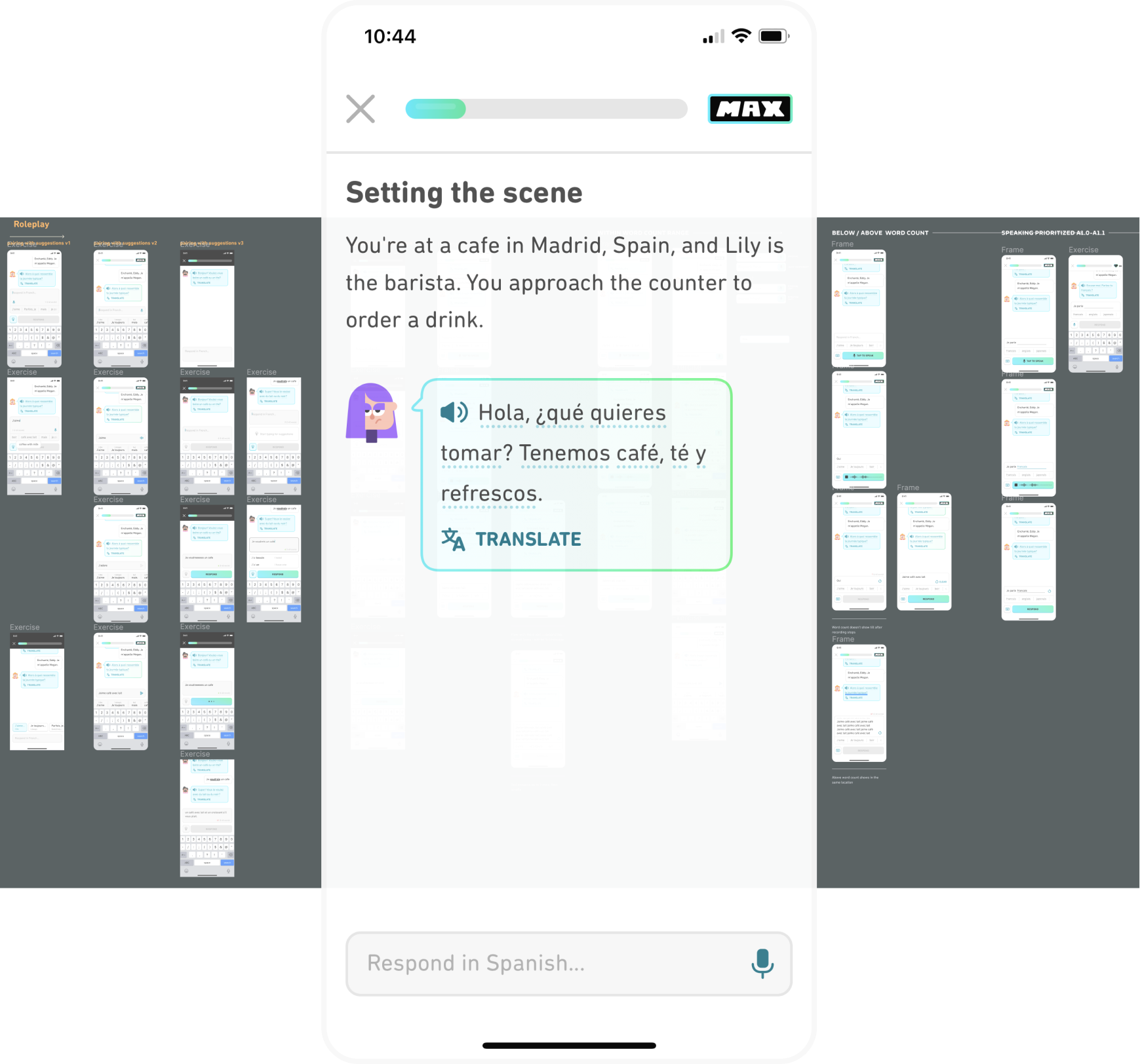
Duolingo Max is a new subscription tier that gives learners access to a learning experience powered by GPT-4. It has been iterating very fast, and generated new usage cases on text input components. The objective was to stay updated and understand the underlying design considerations.
Insights from the updated text inputs in other company products like DET (Duolingo English Test) and internal tools, facilitated my comprehension of the company-wide standard.
Differentiate text entry components in the app to narrow scope and better address specific user needs.
Following the discussions, I learned that the single character inputs have been deprecated, and realized even the one-line inputs can be divided into two types, which we hadn't considered before. It made it easier to prioritize and decide this project's target component, which is the one-line text input on the top.


Two prioritized topics need to be addressed to enhance the accessibility experience.
1
How might we design to improve accessibility while maintaining the consistency in the overall user interface design?
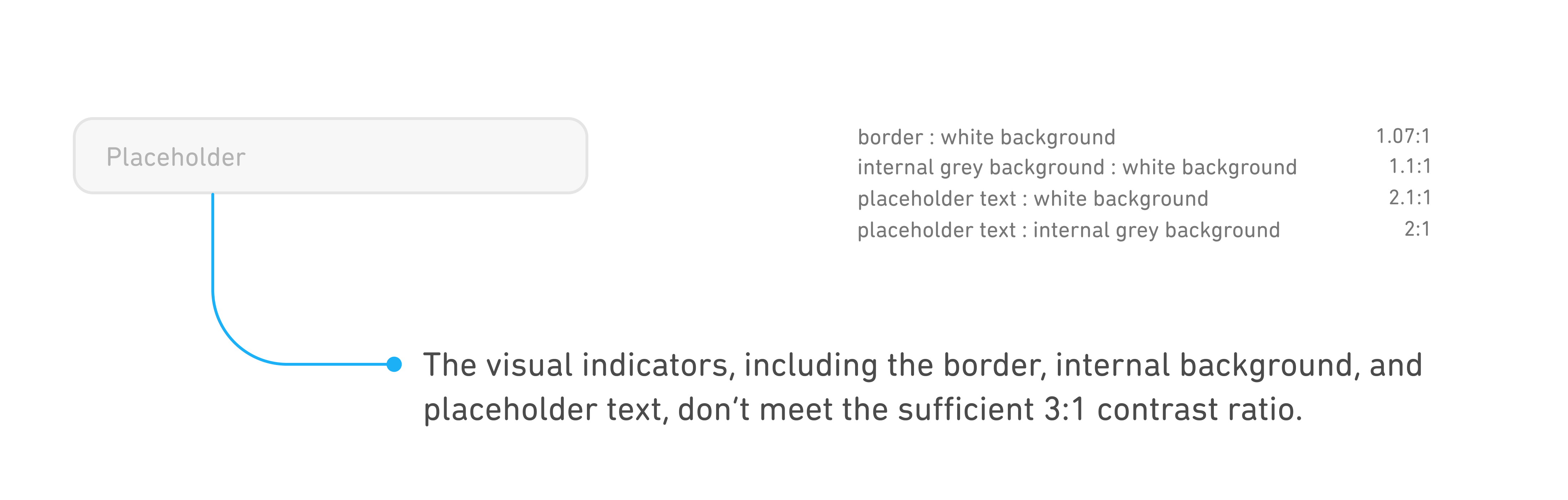
- non-text contrast ratio is lower than minimum requirement. (input box outline : background)
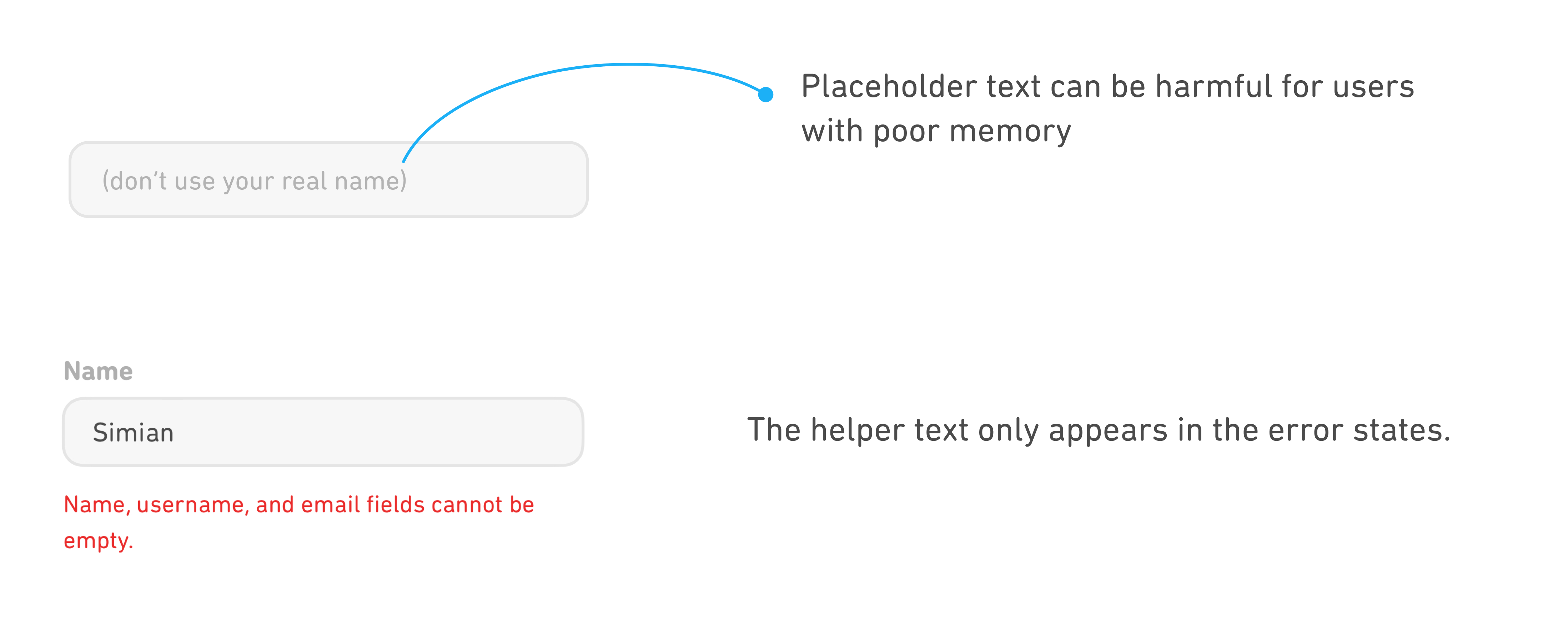
- important help information displayed in placeholder text is unfriendly to users with poor memory.
- the absence of icons to indicate states is unfriendly to color-blind users.
- important help information displayed in placeholder text is unfriendly to users with poor memory.
- the absence of icons to indicate states is unfriendly to color-blind users.
2
How might we design to provide sufficiently strong visual indications on states?
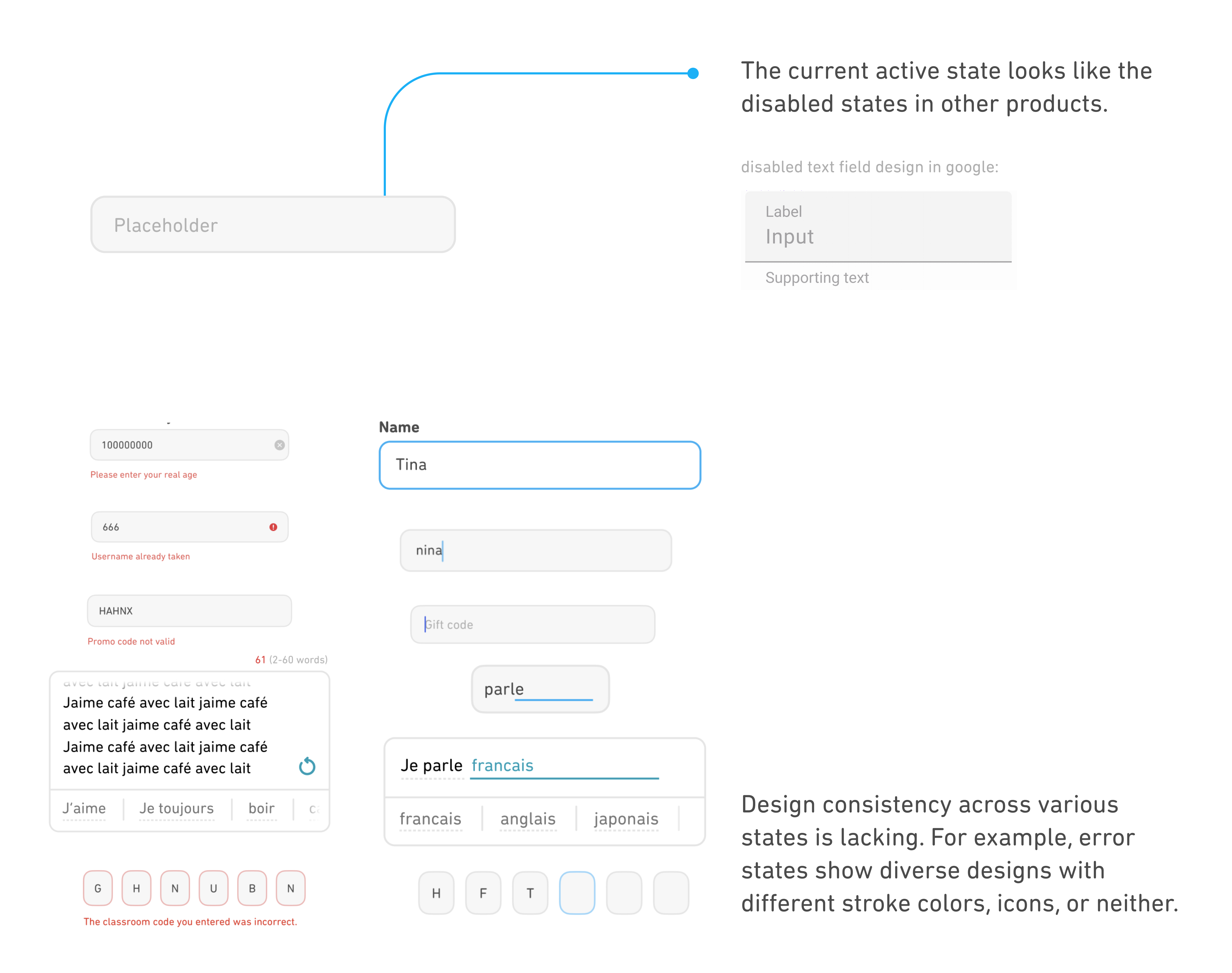
- the current active state looks like the disabled states in other products.
- inconsistency on indicating focused and error states.
- inconsistent usage on icons.
- inconsistency on indicating focused and error states.
- inconsistent usage on icons.

- Insufficient display of important help information.
- Low non-text contrast ratio.
- Low non-text contrast ratio.
Current design
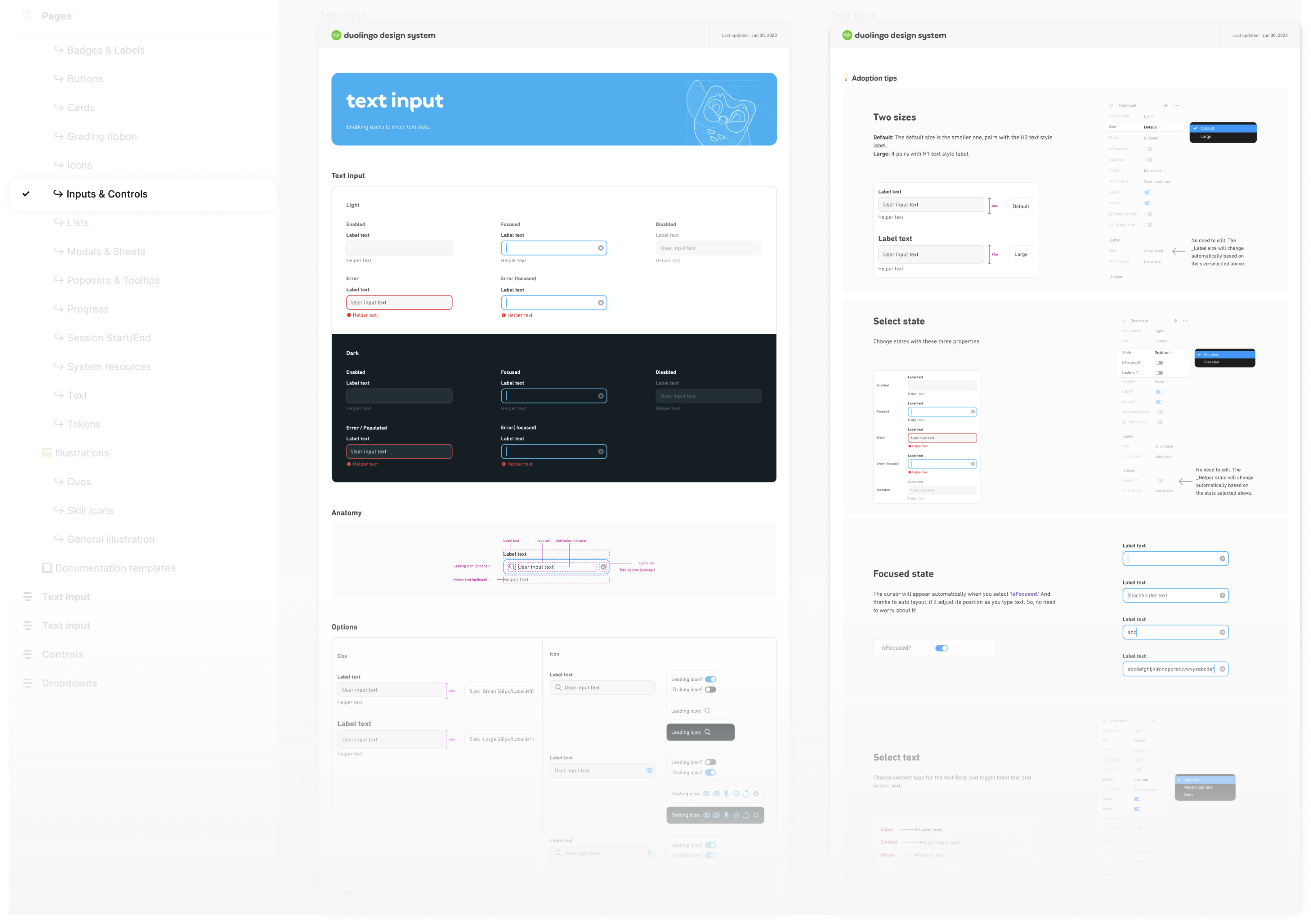
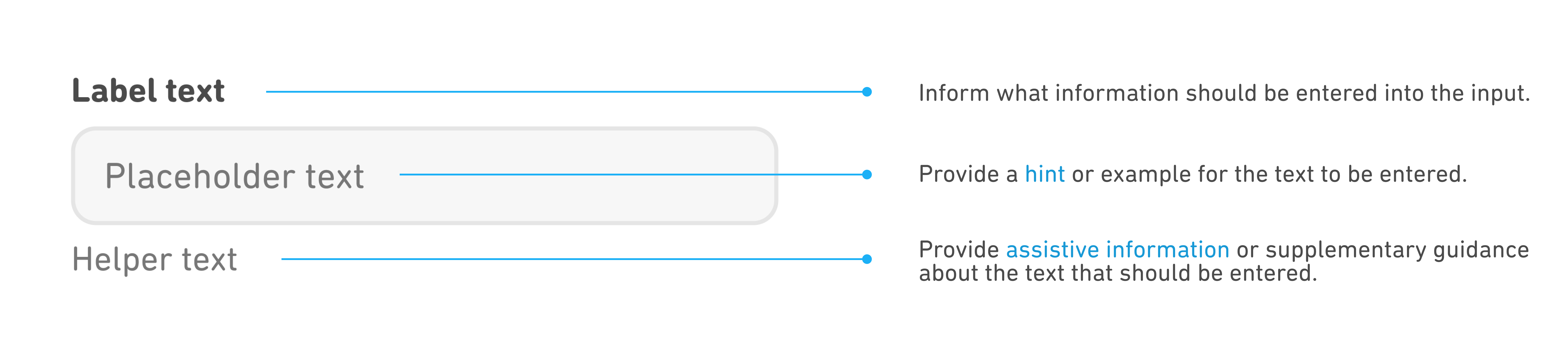
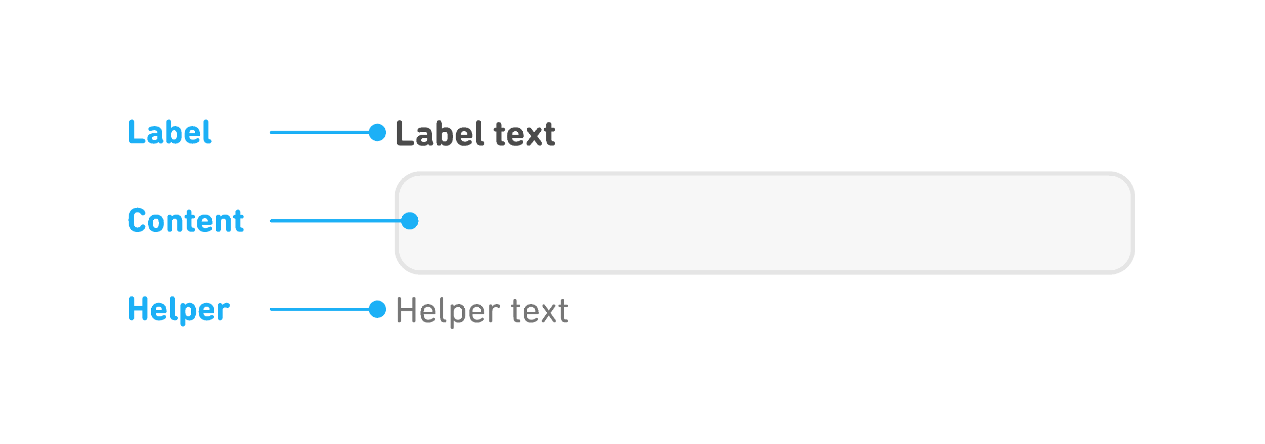
Through my research, this is the common anatomy of a text input.
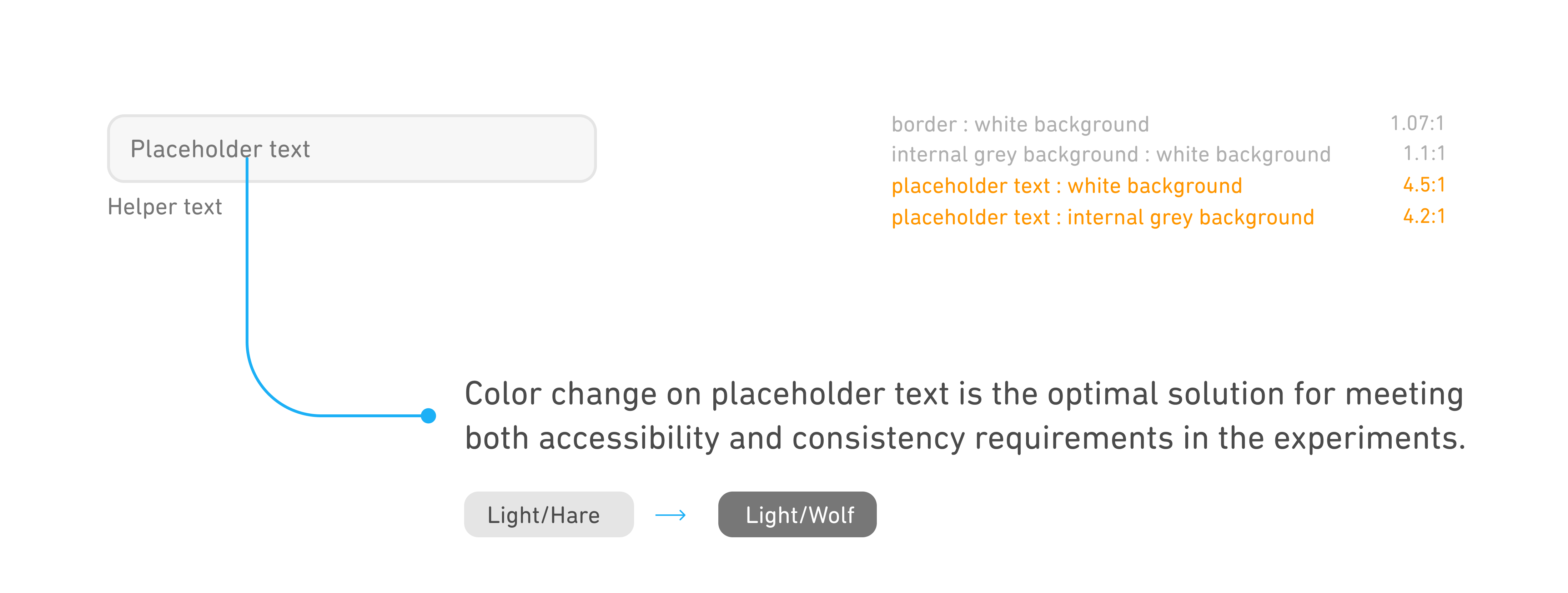
- In design system, the new text inputs don't show the placeholder text. Because we want to encourage our designers to consider using helper text to display important assistive information.
- Improve the contrast ratio for both the placeholder and helper text.
- Improve the contrast ratio for both the placeholder and helper text.
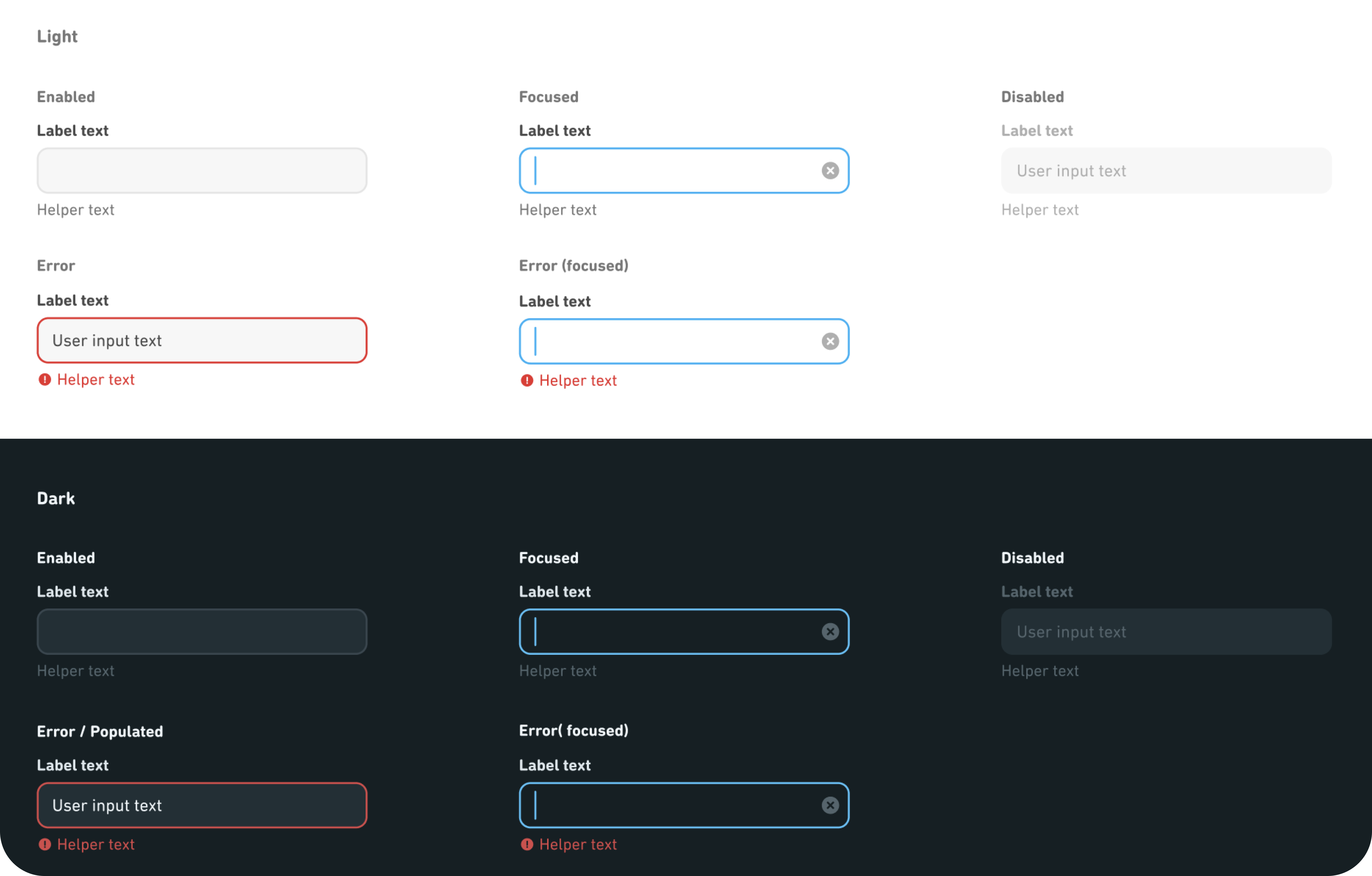
Iterated design

Prioritize quick identification of information hierarchy.
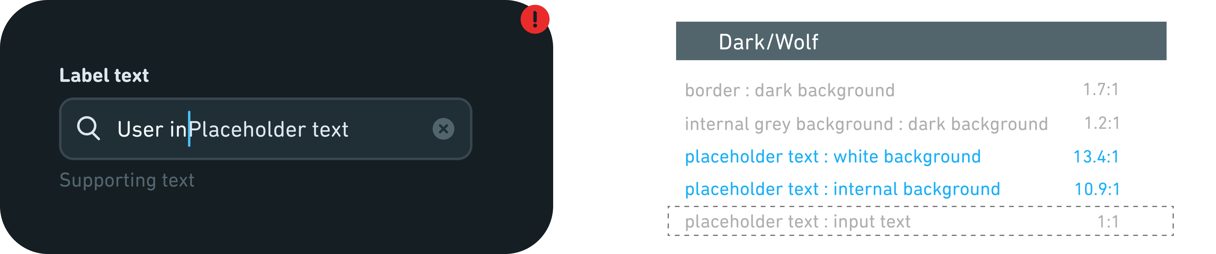
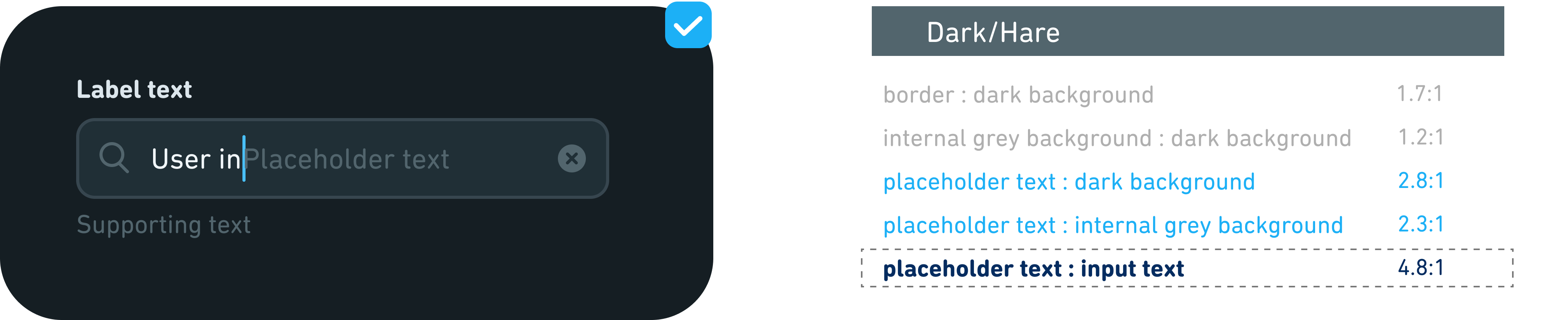
In addition to the light mode, we also want to focus on the accessibility of dark mode.
Dark mode design adheres to light mode principles. Initially, Dark/Wolf was considered for placeholder text, reflecting Light/Wolf in light mode. However, its low contrast with the stronger input text color can hinder users' ability to differentiate between input text and placeholder text. Thus, I suggest using Dark/Hare, a lower tier color, for placeholder text and recommend expanding our color palette for future contrast needs.
Dark mode design adheres to light mode principles. Initially, Dark/Wolf was considered for placeholder text, reflecting Light/Wolf in light mode. However, its low contrast with the stronger input text color can hinder users' ability to differentiate between input text and placeholder text. Thus, I suggest using Dark/Hare, a lower tier color, for placeholder text and recommend expanding our color palette for future contrast needs.
Current design
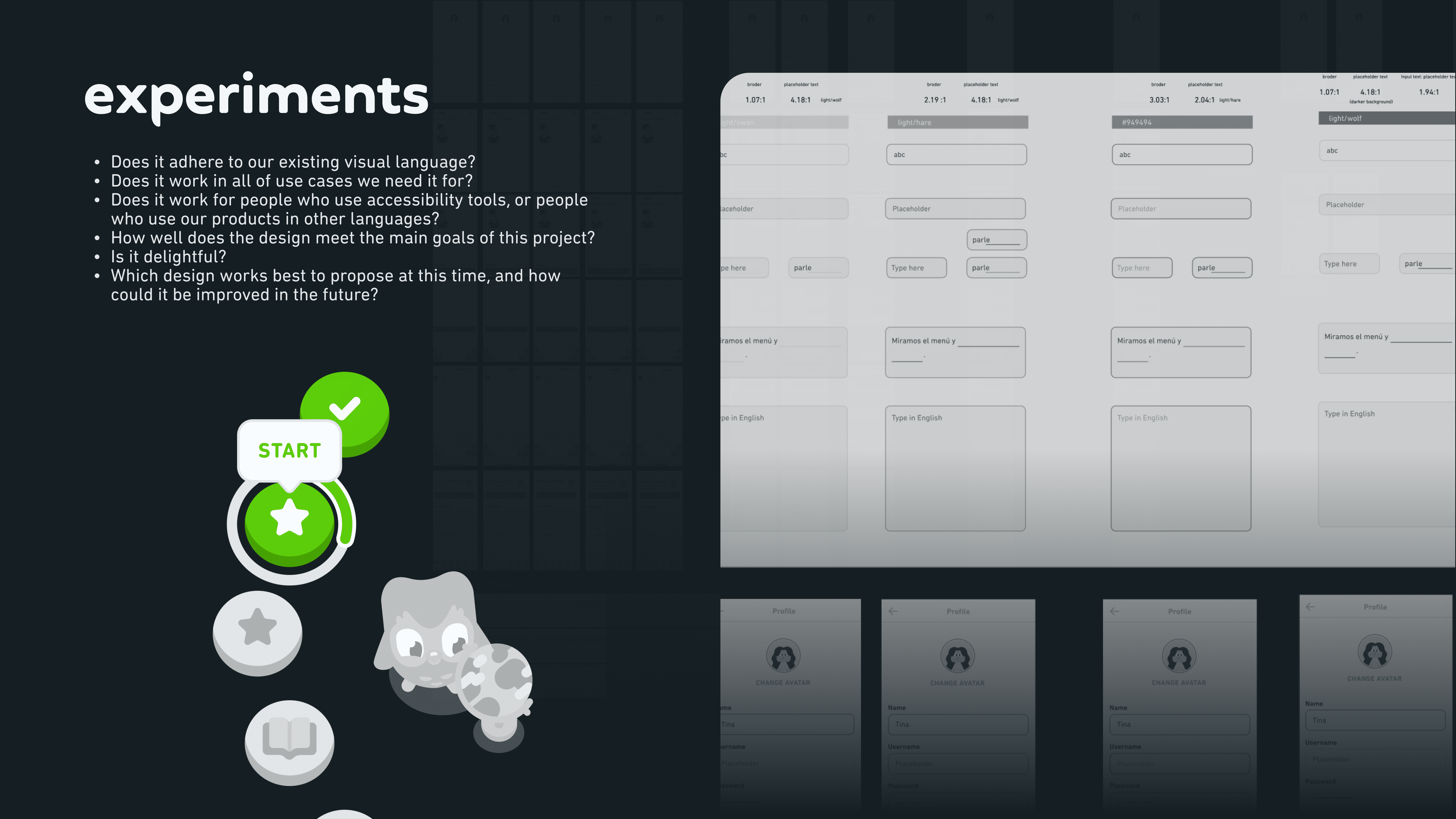
Experiment
Iterated design

Current states design are not consistent and strong enough.
Current design
Enhanced consistency and visual indications.
These represent the optimal solutions derived from our experiments, primarily focusing on color unification and providing enough visual indications to communicate different states.
Iterated design
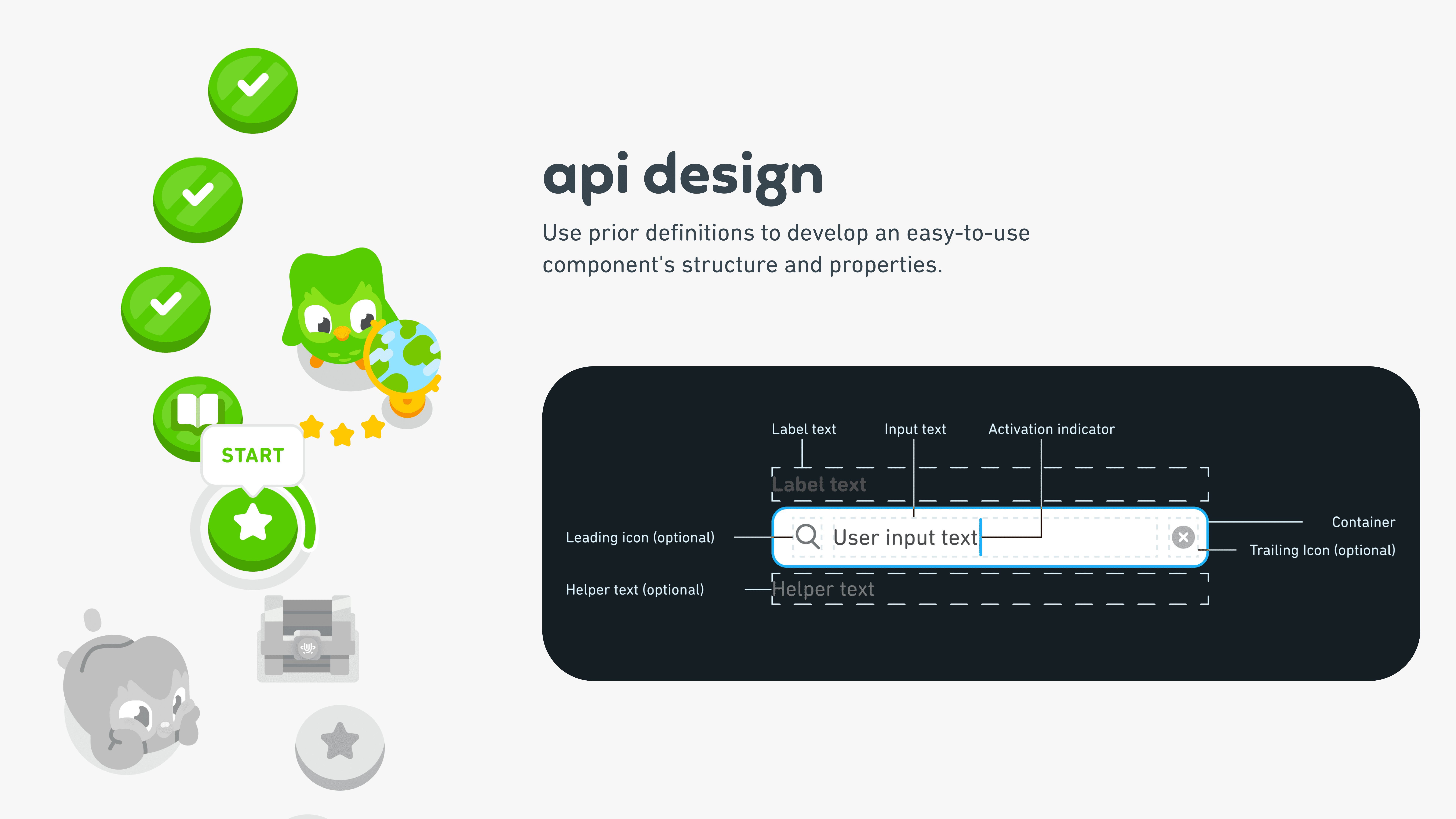
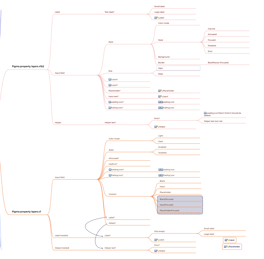
I used Xmind (a mindmap tool) to organize and reorganize the structures and properties flexibly.
.gif)


Use prior definitions to develop an easy-to-use component's structure and properties.
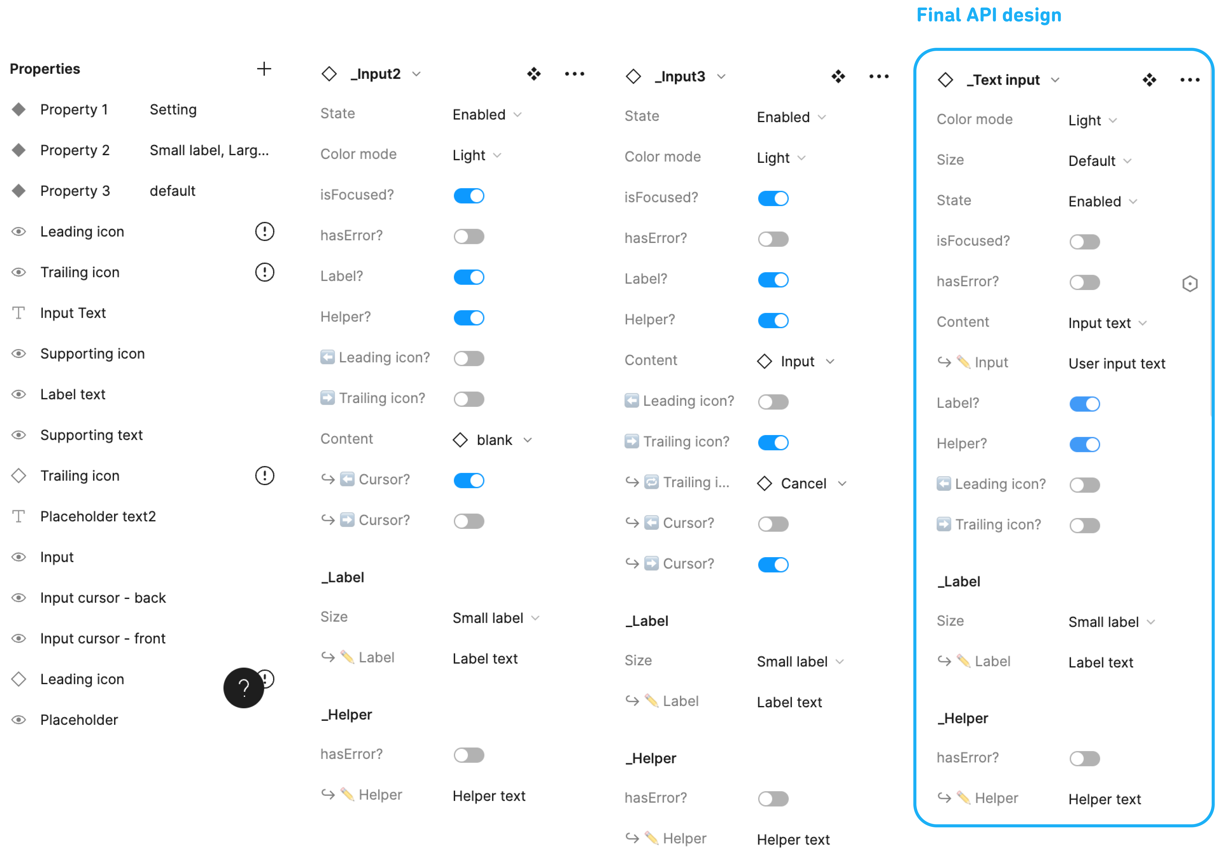
Following multiple usability tests and iterations, I successfully crafted the most streamlined and effective API design. This enables designers and developers to swiftly select the needed text input design.
According to the usability test results, organize the information structure from top to bottom.


The above documents can provide enough information for developers. However, we received feedback on a PR session to associate each icon with its corresponding action to avoid arbitrary use of icons. So I further designed the user flow to help developers upgrade text input component tokens. The following documents show the two featured flows I designed, namely the password mode and the verification mode.
Demo

I really dig the vibe at Duolingo. My colleagues had my back when I shipped the design – they're just the best! A big shoutout to my amazing mentor Ash!


I'm really grateful to have the opportunity to take full ownership of a complete systems design project. Usually, a systems designer should have more senior-level industry experience. As an intern, I did face challenges confidently presenting ideas and making suggestions. However, this is a good thing for me, as it allowed me to see where I could grow. Below are the three aspects that I recieved feedback on, and I believe I'll improve in these areas in the near future.
- Don't hesitate to ask more questions! And utilize the Slack channels to inquire further.
- Having now become more familiar with the product, system design methods, and processes, I could improve my allocation of time on each task for more efficient time management.
- With more practice, I can enhance my presentation skills in meetings.

